Graph View
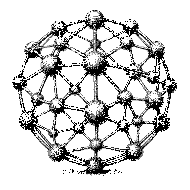
The graph view is a representation in which individual objects are shown as points and their relationships as lines between them. It makes visible what remains hidden in a list or table: how things are connected to one another.
The graph view is a specific way of displaying data on screen. Each individual thing is drawn as a point, such as a note, a person, or a web page. If two of these things are connected to one another, a line joins their points. The result looks like a web of points and strokes. Experts call the points nodes and the lines edges. Such a web of nodes and edges is called a graph in mathematics — hence the name.
What a web reveals and a list conceals
Most programs display data as a list or table. This is practical when looking for something specific. But it has a weakness: a list places everything side by side without showing the connections. You see three hundred file names, but not which of them reference one another.
The graph view turns this around. It shows the relationships as the actual information. This makes patterns noticeable that no one would have thought to look for. A point with very many lines is evidently important or central. A point with no lines at all has been forgotten. A group of points that are densely connected among themselves and barely connected outward forms its own topic area.
This is precisely why investigators use such views to examine money flows between companies. A tangled web of transfers is practically invisible in a table with ten thousand rows. As an image, one recognizes within seconds that all paths run through the same single shell company.
How connections become a picture
First, the program needs the data itself: a list of all objects and a list of all connections between them. These connections often arise automatically. In a note-taking app, every link from one note to another counts as an edge. In a social network, every friendship counts.
Then comes the difficult part: where should each point be placed? The order of the data provides no position. A common method can be imagined like a model of springs and magnets. Connected points are pulled toward each other by an imaginary spring. All points simultaneously repel one another so they don’t end up on top of each other. The computer lets this interplay of forces run for a few seconds until everything settles down.
An important misconception here: the specific positions mean nothing. Up, down, left, and right are arbitrary, and the picture often looks different the next time it’s opened. What is meaningful is only what lies together and what lies far apart. A second problem is size. Beyond a few thousand points, the web becomes an unreadable tangle of yarn. That’s why good programs offer filters that show only a section.
From note-taking apps to knowledge graphs
The graph view is best known through note-taking programs like Obsidian or Logseq. Anyone who links many notes to one another there can have their personal knowledge network displayed as an image. Roam Research has also made this representation popular.
In enterprises, it appears in security software. There it shows which servers are communicating with one another and highlights unusual connections. In data analysis, it is part of the standard toolkit of providers like Neo4j or Palantir.
In AI news, the term is usually encountered alongside the word knowledge graph. This refers to a database that stores facts as relationships, for example that a certain company acquired another one. Language models are increasingly being connected to such databases so that they look things up instead of guessing. The graph view is not the technology itself, but merely the window onto it. It helps people check whether the stored relationships are actually correct.